I love pulling out the physical artifacts of our typographic history for the participants of Typographic Printing Program. We call it story time here. «C’mon uncle Dafi, tell us an other story!» And everybody’s happy. Okay, here we go…
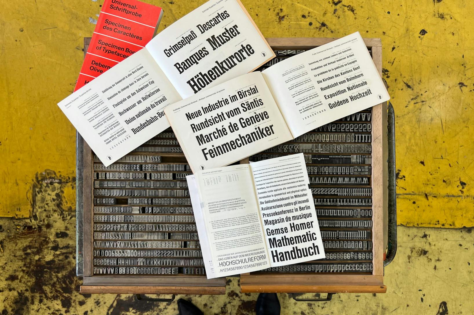
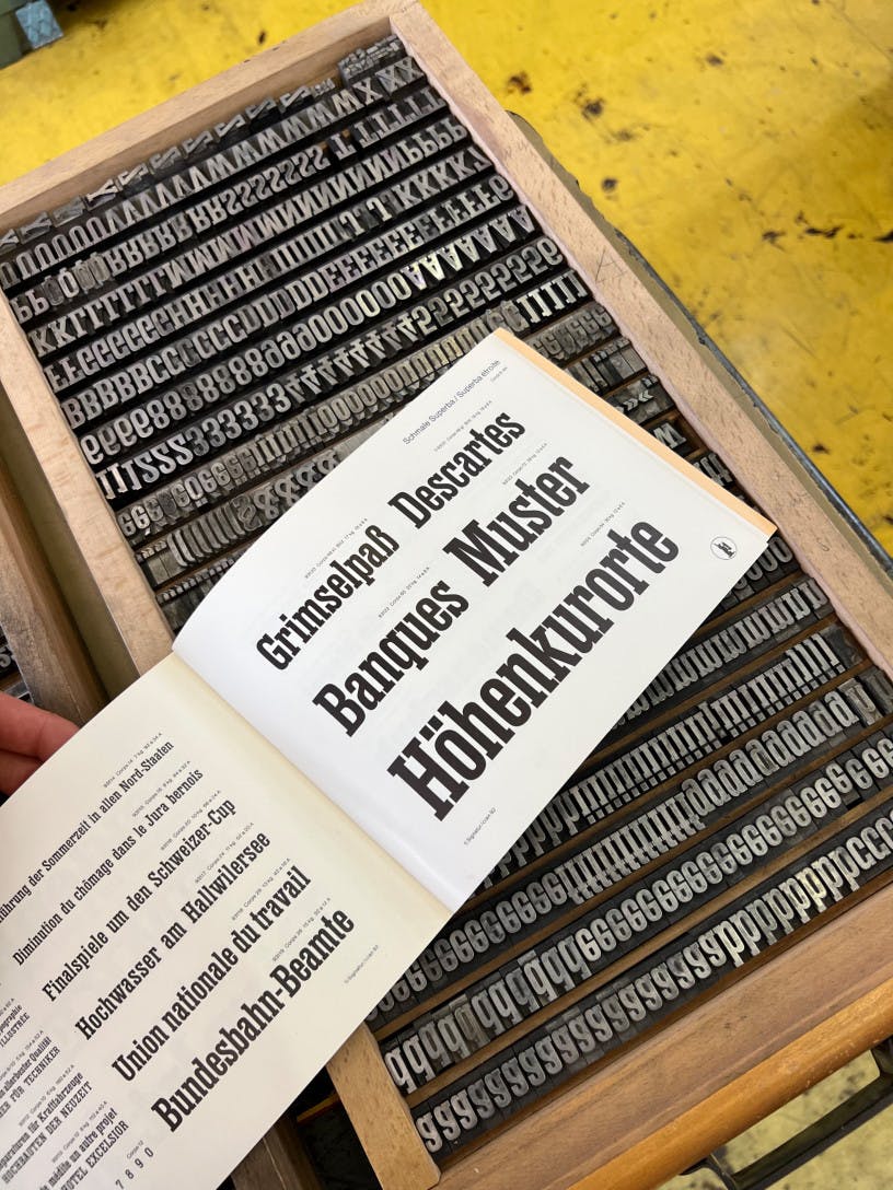
Superba is the name of a beautiful Egyptian style slab serif designed by Edmund Thiele and offered by Haas’sche Schriftgiesserei (Haas Type Foundry) in Münchenstein, Switzerland. It was cast in foundry metal type from 1934 on. It also was licensed and and offered as poster type (wood type) by the Swiss poster type manufacturer Roman Scherer a few years later.
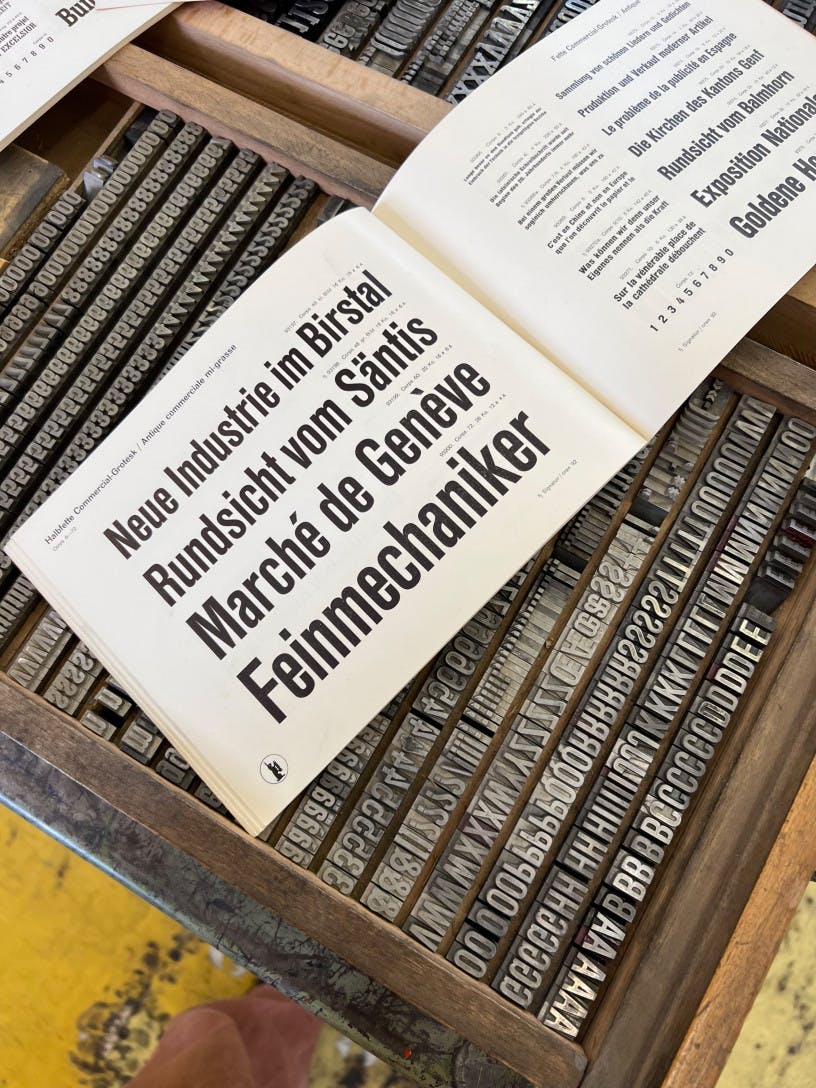
However, in 1940 Edmund Thiele designed Commercial Grotesk, a condensed sans serif for Haas Type Foundry. In that process, he basically cut off the serifs of Superba Condensed. The similarities between Superba Condensed and Commercial Grotesk are astounding–and what’s even more impressive was how well Commercial Grotesk worked as a condensed sans, which basically was just a slab serif with chopped of serifs. Commerical Grotesk was very common as a foundry metal type face and still can be found in many letterpress print shops throughout Switzerland.
But the transformation process of Superba was not finished yet. The next chapter was written an other 30 years later when Helvetica by Haas Type Foundry was in full bloom. Around 1970 Haas needed to expand the styles they offered for their most important face of that time. Since the competition was on between many European foundries offering similar sans serifs in many styles. To quickly expand the styles of Helvetica, Haas simply transformed Commercial Grotesk to Helvetica Schmalfett and Helvetica Schmalhalbfett by changing just a few letterforms. Alfred Hoffman, former director of Haas once told me, it was basically done over night. The features of Commercial Grotesk were very close to Helvetica. And cutting all completely new sets of punches would have been very labour intense, when competitors already had large typeface families ready on the market. So basically Commercial Grotesk mainly got renamed (with a few slight changes like the «t» or the «4») over one night.


Since at the studio in Näfels I have Superba, Commercial Grotesk and many styles of Helvetica, it is the perfect chance to take a little break from all the sketching work the participants do. So we pull out the physical artifacts of this incredible story, take that break for story time! And really, everybody’s happy—including me.
For more details see: Lars Müller and Victor Malsy (eds.). Helvetica forever: Geschichte einer Schrift. Baden: Lars Müller, 2008.